Your brand, built to show up confidently
everywhere it needs to be.
We're a brand identity and creative studio working with founders and businesses who are ready to invest in how they show up. Starting fresh or already have a brand, we build it, bring it to life, and keep it consistent across every touchpoint.
One team. Start to finish
This is why we exist…
Most brands have a gap. Between how good the business actually is and how it looks to the world. Between getting a logo designed and having a brand that actually works everywhere.
We exist to close that gap, one team, one relationship, everything your brand needs to show up consistently and make your life a whole lot easier.
BRANDING
•
PACKAGING
•
TRADE SHOW
•
WEB DESIGN
•
CONTENT
•
COURSE CREATION
•
BRANDING • PACKAGING • TRADE SHOW • WEB DESIGN • CONTENT • COURSE CREATION •
Whether you're starting fresh or need a team to keep your brand consistent, we make it simple, handle everything, and stay for the long run.
Whether you’re ready for a full rebrand or just need support refining what you already have, we’ll help you find the right next step.
-
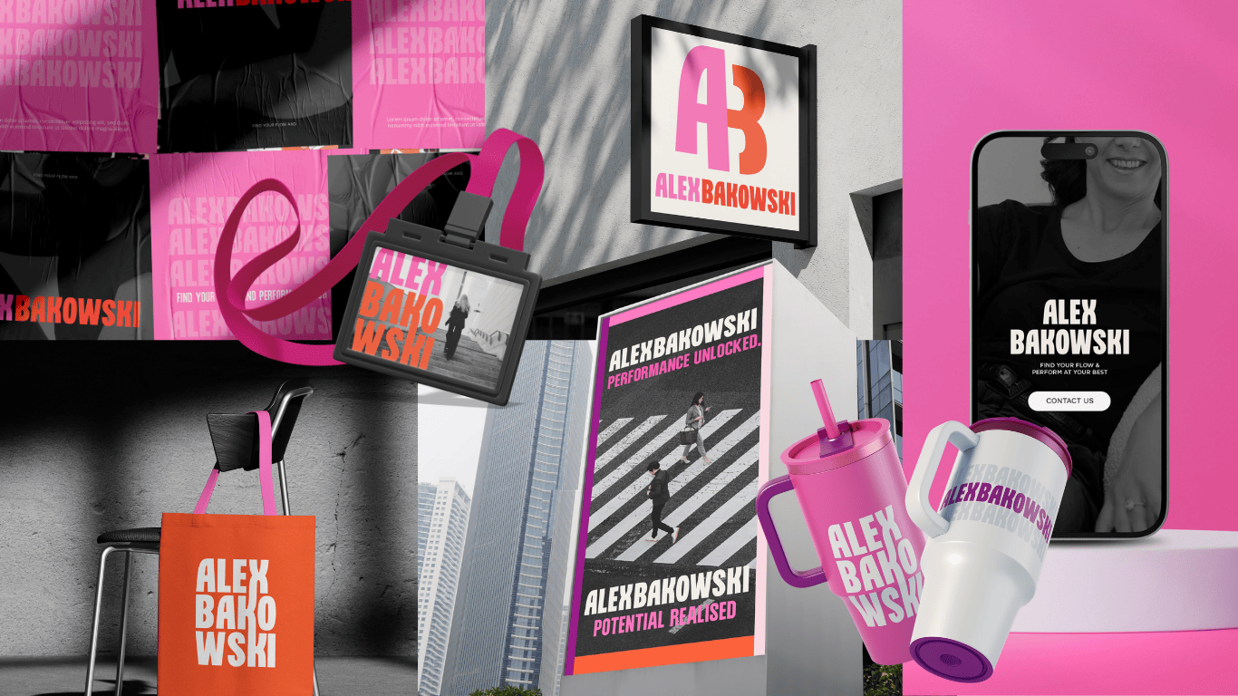
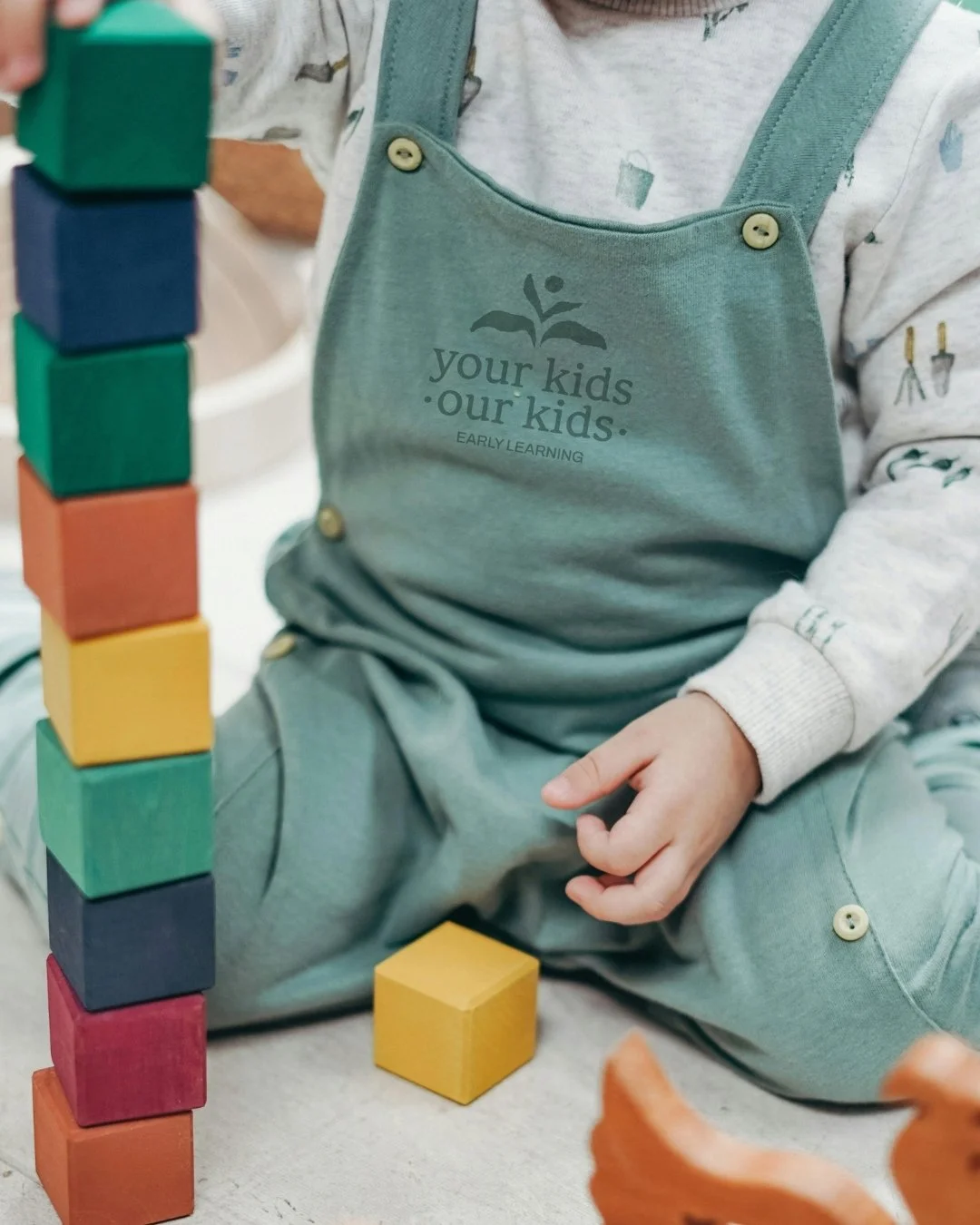
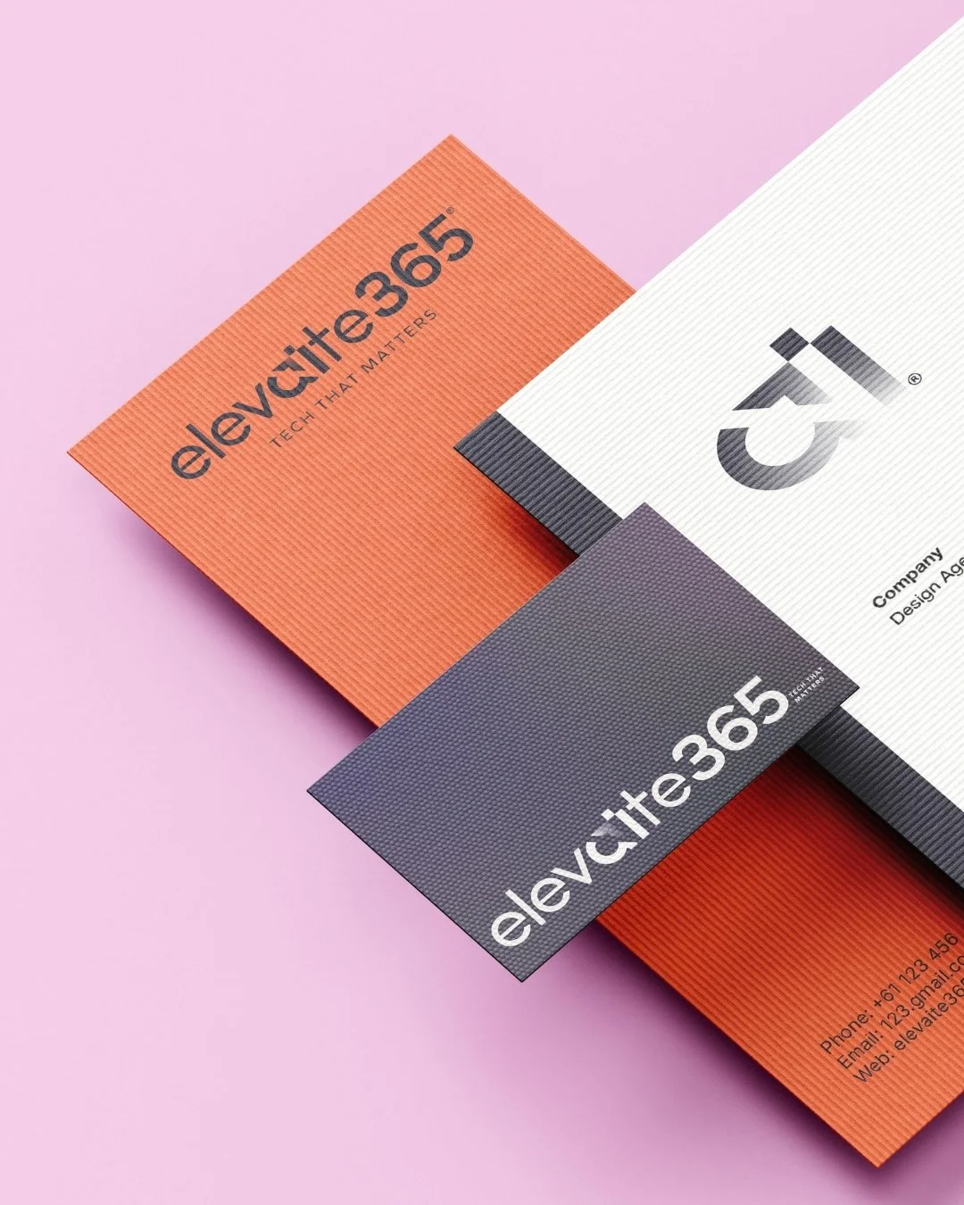
Clear, considered brand foundations that give your business direction, confidence and room to grow. We create brands that are distinctive, memorable and reflective of the quality of what you offer, so everything that follows feels aligned from the start.
Logos
Visual identity
Brand guidelines
Find out more here
-
Everyday design support to keep your brand consistent and considered wherever it shows up. From campaign assets to practical marketing materials, we design with both clarity and usability in mind.
Lead magnets
Campaign collateral
Social media graphics
Email design
Website graphics
Presentation decks
Find out more here
-
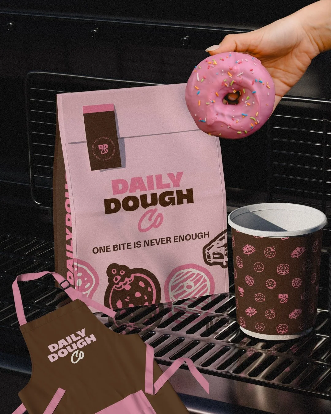
Packaging designed to feel aligned, intentional and ready for shelf, screen or shipping. We create packaging that reflects the quality of your product and works hard for your brand in real-world settings.
Find out more here -
On-brand content designed for consistency across your digital channels. We create flexible, reusable assets that make showing up online feel easier and more cohesive.
Templates
Carousel design
Reel design
GIFs
Story templates
Highlight covers
Find out more here
-
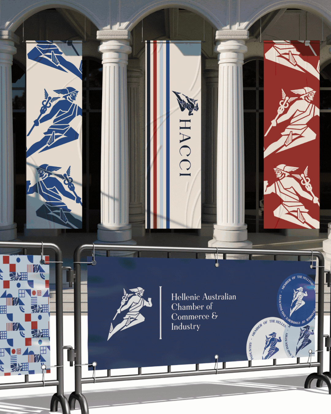
Strategic, on-brand trade show design that helps your business stand out and show up confidently in person. From booth visuals to supporting assets, we design with clarity, consistency and impact in mind.
Find out more here
-
Custom illustrations designed to support your brand identity, adding personality, warmth and distinction where it matters.
Brand Icons
Pattern Elements
Character Design
Find out more here


From brand identity to packaging, trade show to digital. Every project built to last.

-
![]()
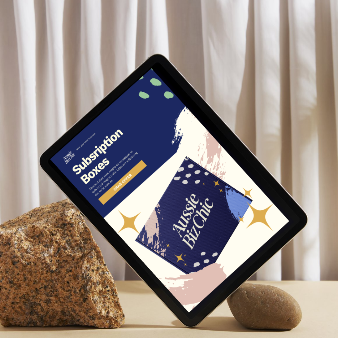
... led to a significant increase in our sales
Working with Complete St Co. was a game-changer for our business, Aussie Biz Chic! Their rebranding expertise not only made our business look more professional but also led to a significant increase in our sales. The attention to detail and the way they captured the essence of our brand was impressive. Jess truly transformed our look and feel, making it more aligned with our goals and audience. If you're looking to take your business to the next level, I highly recommend Complete St Co.
MICHELLE
FOUNDER OF AUSSIE BIZ CHIC -
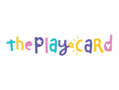
![A colorful booth display for 'The Play Card,' featuring various children's products on shelves and decorations with playful designs. Walls have slogans 'Everyday Items. Extraordinary Play' and 'Internationally award-winning.' Images of children playing and product packaging are visible.]()
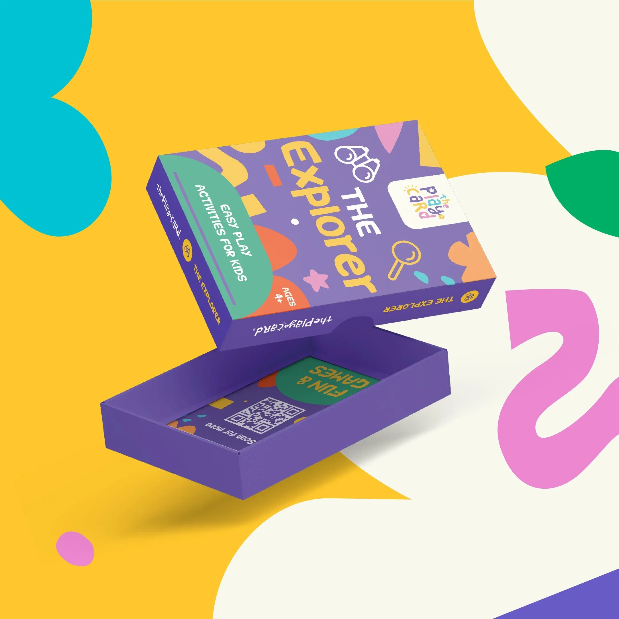
... they absolutely exceed any expectation of working with a designer.
The Complete St team is beyond incredible. In short, they absolutely exceed any expectation of working with a designer. The communication is exceptional, the end-to-end service is exceptional and I still haven’t found the word for ‘extra-exceptional’ that describes the finished product. I know that they have transformed my business and my brand into something I thought only existed in my mind
Thank you, team, you are incredible!ZARA
FOUNDER OF THE PLAY CARD CO -
![branding and design agency]()
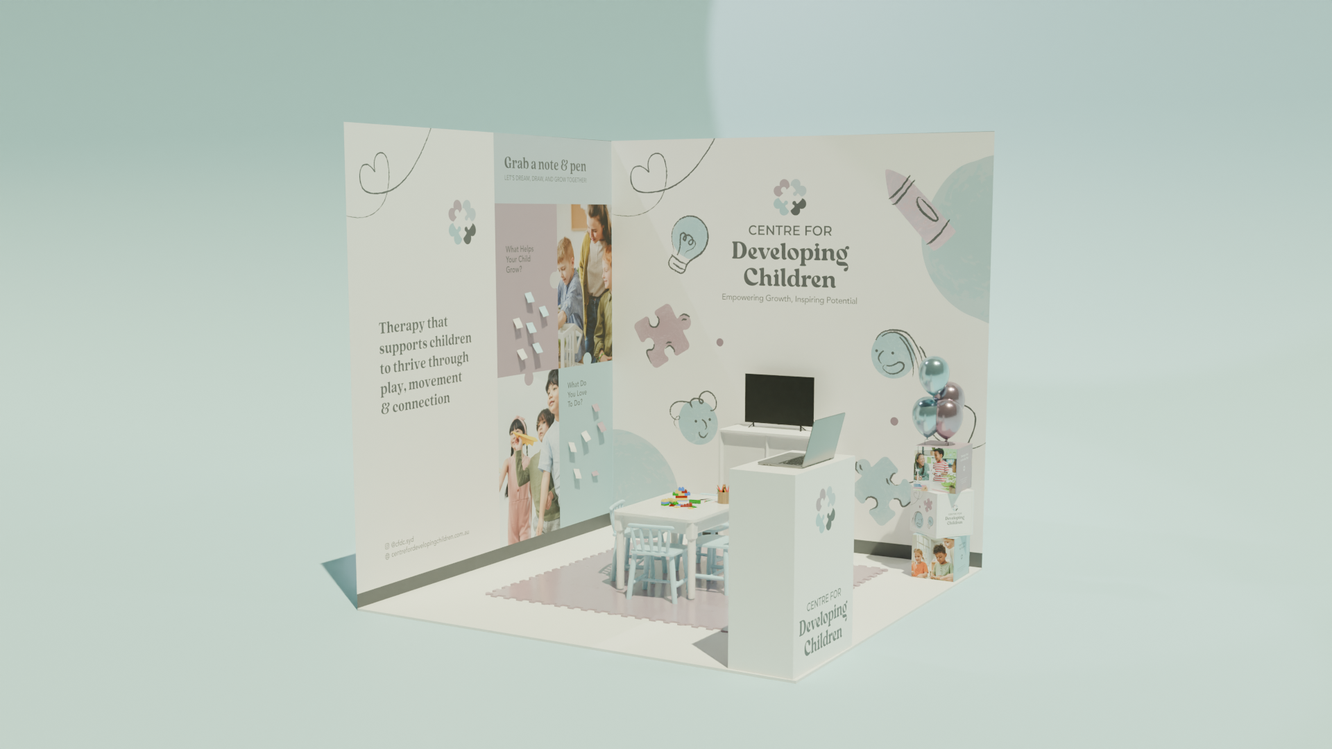
... her guidance made the entire process seamless
Working with Jess was an incredible experience! She truly brought my brand vision to life with creativity, professionalism, and attention to detail. Her guidance made the entire process seamless, and I'm beyond happy with the results. Thank you Jess!!RAQUEL
FOUNDER OF CENTRE FOR DEVELOPING CHILDREN -
![]()
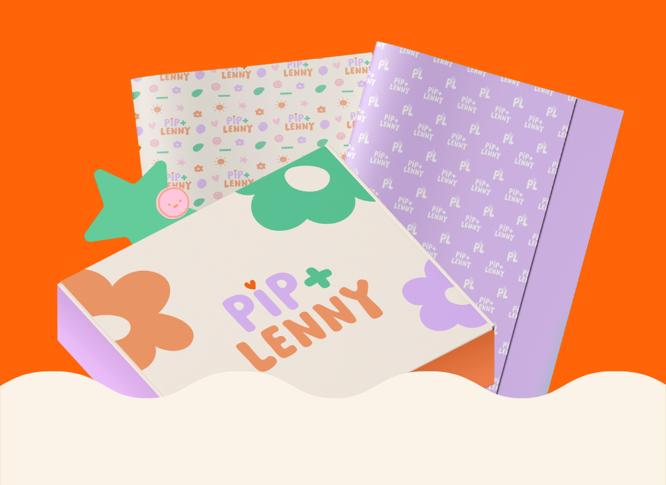
... final design captured our vibe and aesthetic perfectly
Jess and her team did a fantastic job of our new branding. We feel the final design captured our vibe and aesthetic perfectly and the process was easy and uncomplicated. This was an extremely positive experience and a team we would highly recommend working with.JUSTINE
FOUNDER OF PIP & LENNY -
![]()
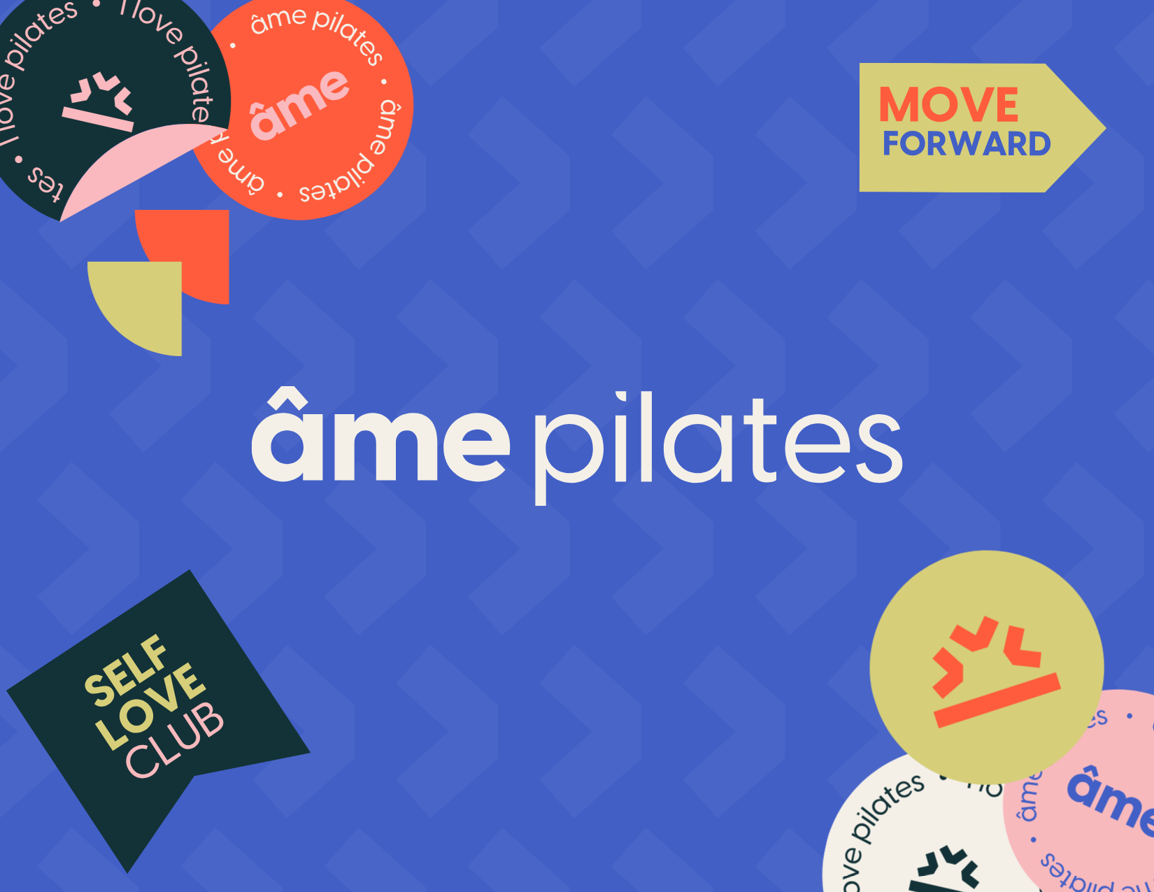
Jess has been instrumental in helping me ... delivered way above my expectations every time.
with all by branding to set up my pilates business! Even when it was a small sole trader business to opening a studio, she has delivered way above my expectations every time. I will without doubt be going back to Jess as the business continues to grow and I need the branding tweaked. Thank you so much Jess, you have made an overwhelming time so much easier and stress free :)
AMY
FOUNDER OF AME PILATES -
![]()
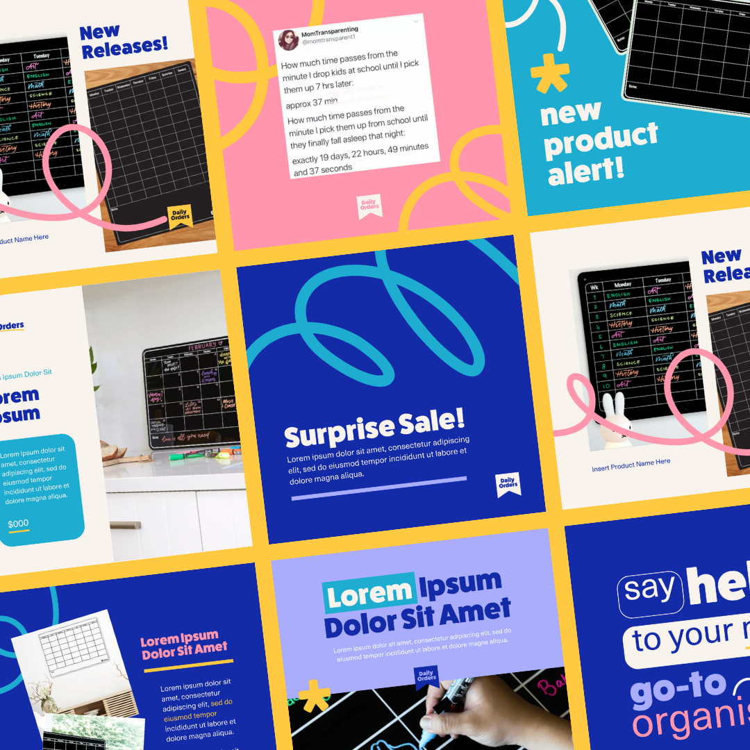
Their communication is excellent and so is their design work.
Jess and the team have been amazing to work with for our new branding. From creating a new logo to supplying packaging and flyer designs, I've been really impressed. Their communication is excellent and so is their design work. Very happy and excited to launch the new branding package!
KELLY
FOUNDER OF DAILY ORDERS

Trusted by Brands Who Are Ready to Grow
We’ve partnered with businesses across retail, product, and service based industries to bring their ideas to life with clarity and confidence.